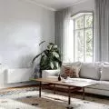
Natural wood, white, beige, navy blue and gold accents - this is how the Poznan apartment by AMJ studio studio can be described in a nutshell. Inspired by the mid-century modern style, the architects have created a subdued interior, fleshed out with interesting details. The use of white and numerous mirrors, on the other hand, allowed to illuminate and optically enlarge the space.
The aim of the project was to create a modern, functional apartment maintained in the spirit of minimalism, but at the same time allowing to feel the home atmosphere, with the kitchen open to the living room in the center. The elements that bind the space together are the oak floor and the vertical wooden slats on the walls in the living room and toilet.
The oak floor and wooden laths bind the entire space together
Photo: Kamil Paszek © AMJ studio
The first element one notices upon entering the apartment is the furniture in the hallway, divided into two parts. The division into a deep white closet and a wooden recess allowed maximum use of the small space of the entrance area - the recessed recess makes it easier to move around the door, creates a place to hang up jackets, and on the shelf one can put keys or a purse. On the side wall of the closet there is a high mirror, which visually enlarges the hallway.
In the kitchenette, one of the walls from the floor to the ceiling has been arranged with built-in furniture. The unusual shape of the apartment was used here as an asset - the widening living room made it possible to design a wide kitchen in a relatively small area. In addition, the working space is enlarged by an island added to the wall, separating the kitchen area from the living room. The color scheme of the fronts is navy blue and light gray juxtaposed with the wood of the countertop. A round table of solid oak wood placed between the kitchen and living room completes the arrangement.
The apartment has an unusual shape
© AMJ studio
In the living room and bedroom, the main theme is wooden laths on a graphite background. They complement the interior, creating a leitmotif - in the living room highlighting the workspace, and in the bedroom the dressing table. The architects hid both these spaces behind hinged fronts.
The bathroom was designed with the same materials as the whole apartment. Cabinets placed right next to the sink itself create practical storage space. An entire wall was arranged as a built-in piece of furniture with cabinets, hiding the toilet bowl rack. Moving the washing machine to the kitchen resulted in more space.
Natural wood, white, beige and navy blue
Photo: Kamil Paszek © AMJ studio
Dobrawa Bies: What were the assumptions and design inspirations? Did you manage to achieve all of them?
AMJ studio: Our starting point was a vision of a bright, unconventional interior that would make investors feel cozy and comfortable. The natural, modern space draws inspiration from the mid-century modern style. The character of the interiors, which is dominated by geometric shapes, clean lines, strives to achieve subdued elegance, sophisticated detailing, playing with colors and contrasts while using noble materials. Additional inspiration came from Italy - the investors' favorite country. The design included decorations alluding to this land, lush greenery and photographs of trips from the Apennine Peninsula. It seems to us that all of the set assumptions were eventually realized.
Garnet in the kitchen contrasts white and gold accessories
Photo: Kamil Paszek © AMJ studio
Dobrawa: What are the principles of designing the space of a small apartment?
AMJ studio: We followed a few main principles in the design. When drawing out the kitchen and cabinets, we fought for every centimeter - furniture built-ins were provided for the ceiling, maximizing storage space. We used a light color palette and reduced the amount of materials. The floor in the kitchen, hallway and bathroom is covered with porcelain stoneware tile of the same pattern, while in the living room and bedroom we laid oak plank. We also opted for strong leading accents - gold accessories and vertical wooden slats at the desk and dressing table, which tie the interior together, further enlarging it visually. An important aspect when designing a kitchen in a small apartment is to use realistic dimensions for appliances, keep the work triangle and a well-planned countertop. In the project, we decided to add a peninsula and it was a hit - it is on it that investors most often prepare dishes.
Vertical slats optically enlarge the space
Photo: Kamil Paszek © AMJ studio
Dobrawa: What did the investors expect, were they open to design suggestions?
AMJ studio: The investors expected a spacious, modern interior that would respond to their interests and passions. They were open to individual solutions - they left us a free hand as to how to transfer them into the project. Taking inspiration from the mid-century modern style, we proposed a subdued interior, fleshed out with interesting detailing, where we can find motifs from their travels - such as a miniature copy of the sculpture of David by Michelangelo.
Dobrawa: The apartment is dominated by white, wood and navy blue in the kitchen, where did this decision come from?
AMJ studio: In keeping with the investors' assumptions and the aforementioned inspirations, white along with mirrors are responsible for illuminating the interior and letting in as much sunlight as possible. Wood as a natural, noble, timeless material perfectly binds the whole space, appears on the floor, countertops, vertical slats on the wall, introducing a sense of calm. The idea for navy blue came when looking for a color that would complement the wood, and at the same time contrast the white and gold accessories. Our first thought was shades of graphite, but we opted for something more unconventional, which definitely appealed to the investors.


